Why Stylish Names Show as Boxes — and How to Fix Them
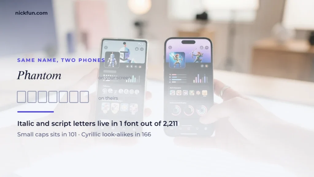
Stylish names show as boxes (▯) when the device displaying them has no font containing those Unicode characters: a missing glyph, not a broken name. NickFUN counted how many fonts draw each style, so you can pick letters that show up everywhere.
Paste any stylish name below to see its plain letters and which characters are rare enough to show as boxes on someone else’s phone. Then use the ranking further down to swap them for styles that far more fonts can draw.
- Plain lettersNick fun Box
- Characters that may show as boxes—
You spend a card on a name, it looks perfect on your screen, and a friend sends a screenshot where half of it is ▯▯▯▯. Nothing went wrong with the copy and paste. The letters arrived intact — their phone just has no font that knows how to draw them.
This page measures which styles that actually happens to. Build a name below, then find its style in the ranking.
Enter your nickname
Choose a style (optional)
Just added for —
Nicknames shared by other players
Add your own idea
Ideas are shown to everyone searching for this name.
What a box actually is
Text and the shapes of text are two separate things. Your name is stored as a list of characters; a font is a book of drawings, one per character. When a device meets a character no installed font has a drawing for, it prints the placeholder — the empty rectangle, sometimes with the character’s number inside it.
So the question is never “is this font installed”. It is: how many fonts anywhere contain a drawing for this character? That number is countable, and it varies enormously between styles that look equally normal in a generator.
How these numbers were measured
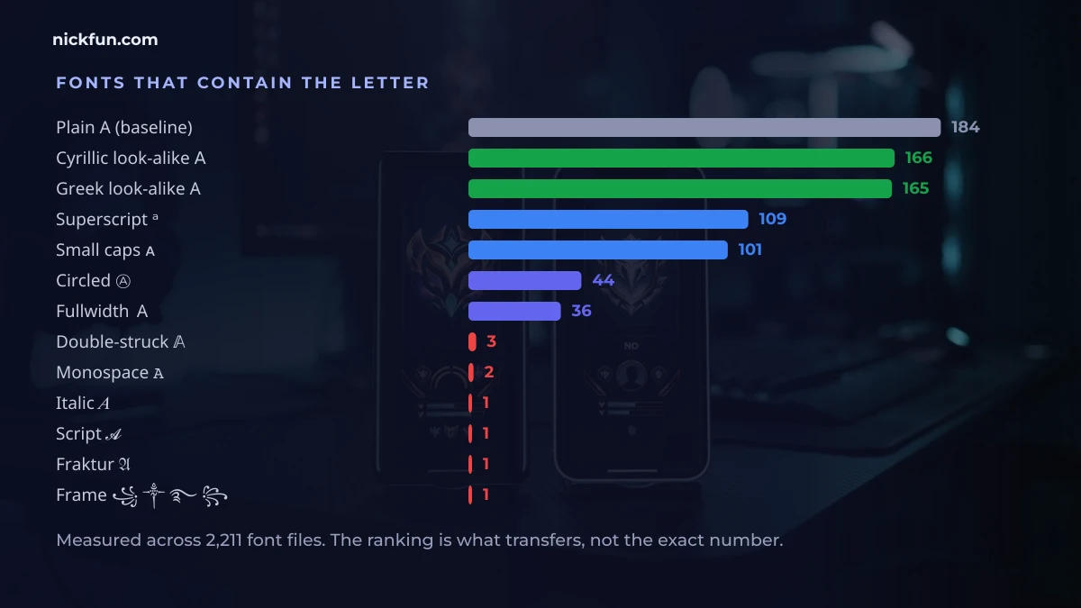
Every figure below comes from one machine with 2,211 font files installed, queried directly for which of them contain each character. For scale: plain Latin A is present in 184 of them.
This is not a survey of phones, and it does not predict any single device. It measures something simpler and more useful — how widely a shape is drawn at all. A character that 165 font families draw will survive almost anywhere. A character that one font draws will not.
Every style, ranked by how many fonts have it
| Style | Sample | Fonts that have it |
|---|---|---|
| Cyrillic-look | А | 166 |
| Greek-look | Α | 165 |
| Upside-down | ɐ | 110 |
| Superscript | ᵃ | 109 |
| Subscript | ₐ | 102 |
| Small caps | ᴀ | 101 |
| Small caps | ꜰ | 99 |
| Circled | Ⓐ | 44 |
| Circled lower | ⓐ | 44 |
| Squared | 🄰 | 43 |
| Fullwidth | A | 36 |
| Tifinagh | ⵣ | 14 |
| Cherokee-look | Ꭺ | 8 |
| Braille | ⠁ | 4 |
| Double-struck | 𝔸 | 3 |
| Sans | 𝖠 | 3 |
| Sans bold | 𝗔 | 3 |
| Monospace | 𝙰 | 2 |
| Bold | 𝐀 | 1 |
| Italic | 𝐴 | 1 |
| Bold italic | 𝑨 | 1 |
| Script | 𝓐 | 1 |
| Fraktur | 𝔄 | 1 |
| Runic | ᚠ | 1 |
Look at the top of that list and then at the bottom. Bold 𝐀, italic 𝐴, script 𝓐 and fraktur 𝔄 — the four styles every fancy-text tool puts first — are each present in exactly one font. They are stored in a block meant for mathematical notation, and outside of maths typesetting almost nobody draws them.
Meanwhile small caps ᴀ sits in 101, superscript ᵃ in 109, and letters borrowed from Cyrillic and Greek in 165 and above — because those are real alphabets that real fonts have to support.
The most copied frame is the least supported
This one is worth its own section, because it is the single most pasted decoration in the whole nickname world:
| Symbol | Fonts that have it |
|---|---|
| ▄ | 89 |
| ☬ | 75 |
| ◤ | 73 |
| ♬ | 50 |
| ⌈ | 44 |
| ★ | 42 |
| ❀ | 41 |
| ✿ | 41 |
| ☆ | 41 |
| 『 | 40 |
| 【 | 39 |
| ︻ | 36 |
| ❤ | 12 |
| ⚔ | 11 |
| ❥ | 6 |
| ❉ | 6 |
| ✵ | 6 |
| ✧ | 6 |
| ✦ | 6 |
| ⚡ | 5 |
| ♛ | 5 |
| ♔ | 5 |
| 𖣘 | 3 |
| ᯓ | 1 |
| ᨓ | 1 |
| ꧂ | 1 |
| ꧁ | 1 |
| ⫷ | 1 |
| ࿐ | 1 |
| ༒ | 1 |
꧁ ༒ ࿐ ꧂ — one font each. The frame everyone recognises is drawn by one file out of 2,211. It renders on the device that generated it and turns to rectangles almost everywhere else.
Compare ▄︻ at 89 and 36, ☬ at 75, ◤ at 73, ★ at 42. If you want a decorated name that survives being screenshotted, the material is already there — it is just not the material the generators show first.
Names that survive, by style
Twenty names in six styles. The number on each chip is that name’s own weakest character — not the style’s best case.
Cyrillic look-alike — 131–166 fonts
The most robust decoration there is. These are ordinary Russian letters that happen to look like ours, and every font with Cyrillic has them.
Greek look-alike — 164 fonts
Superscript — 107–109 fonts
Small caps — 99–102 fonts
Upside-down — 9–110 fonts
Careful with this one. The headline number is 110, but ǝzɐlᗺ drops to 9 — the turned capital ᗺ is borrowed from Canadian Aboriginal syllabics and almost nothing draws it. The number on each chip is that name’s own weakest letter, not the style average.
Circled — 43 fonts
The lowest of the six. Fine on a desktop, the first to box out on an older phone.
Safe symbols — 36 fonts and up
Thin support — under 36 fonts
Not unusable, but these are the ones that box out first.
Attitude and aesthetic username ideas that stay visible
Most attitude and aesthetic username ideas online rely on ꧁ ꧂, bold script or gothic letters — exactly the pieces that turn into boxes. These 20 keep the look but use only characters that at least 36 font files draw: look-alike letters, small caps, tiny text and the widely supported frames from the ranking above. Tap to copy, then swap the word for your own.
Attitude usernames
Aesthetic usernames
Symbols that are not emoji, and emoji that are not symbols
One more distinction worth knowing, and this measuring machine happens to prove it: it has no emoji font installed at all. That makes the split visible.
The old symbols below live in ordinary text fonts. They still drew perfectly on a machine with zero emoji support, which is why they also survive in places where emoji do not — plain-text fields, terminals, old software, some game name boxes.
In text fonts (numbers are real font counts)
Thin — in a handful of text fonts
Emoji-font only
No number on these on purpose. They were absent from all 2,211 files here, because they exist only in a colour emoji font — which every phone has and this server does not. On a phone they are universal; in a plain-text field they are the first thing to disappear.
Kaomoji, safest first
Um rostinho vale o que vale o seu caractere mais raro — e a diferença entre os dois grupos abaixo é enorme. (^_^) marca 736 porque cada peça dele é pontuação comum, desenhada por praticamente qualquer fonte. (◕‿◕) cai para 41, porque ◕ existe em 41 arquivos; ᕙ(⇀‿↼)ᗢ chega a 4. O número em cada chip é o do caractere mais fraco daquele rosto, não a média — o grupo de cima atravessa um screenshot em quase qualquer aparelho, o de baixo é aposta.
99 fonts and up
Under 99 fonts
Kaomoji, ranked the same way
A kaomoji is only as portable as its rarest piece. (^_^) is built from keyboard characters and is effectively universal; ᕙ(⇀‿↼)ᕗ depends on a harpoon arrow that four fonts draw.
| Kaomoji | Weakest character | Fonts |
|---|---|---|
| (>_<) | _ | 737 |
| (^_^) | ^ | 736 |
| (•_•) | • | 252 |
| (T_T) | T | 184 |
| \(^o^)/ | o | 184 |
| (-_-)zzZ | Z | 184 |
| (°o°) | ° | 179 |
| (¬_¬) | ¬ | 176 |
| (¬‿¬) | ‿ | 106 |
| (ง •̀_•́)ง | ง | 104 |
| ʖ | 102 | |
| ʕ•ᴥ•ʔ | ᴥ | 99 |
| (ᵔᴥᵔ) | ᴥ | 99 |
| (◕‿◕) | ◕ | 41 |
| ٩(◕‿◕)۶ | ◕ | 41 |
| (*≧ω≦*) | ≦ | 39 |
| (≧▽≦) | ≦ | 39 |
| (◠‿◠) | ◠ | 38 |
| (o・ω・o) | ・ | 38 |
| ヽ(•‿•)ノ | ノ | 37 |
| (っ◕‿◕)っ | っ | 37 |
| ヽ(ー_ー )ノ | ノ | 37 |
| (⁀ᗢ⁀) | ᗢ | 9 |
| ᕙ(⇀‿↼)ᕗ | ↼ | 4 |
Which Unicode blocks fail, and where
Every styled letter belongs to a Unicode block, and whole blocks tend to succeed or fail together, because a font either covers a block or skips it. This table groups the ranking above by block (font counts measured by The NickFUN Team in September 2026, out of 2,211 font files).
| Unicode block | Styles that use it | Fonts that draw it | What that means for your name |
|---|---|---|---|
| Mathematical Alphanumeric Symbols | Bold, italic, cursive script, gothic, outline, monospace | 1–3 | Screen-only: fine on your own phone, often boxes elsewhere |
| Enclosed Alphanumeric Supplement | Squares 🄰, black bubbles 🅐 | 43 | Mostly safe on current phones |
| Enclosed Alphanumerics | Bubble Ⓐ ⓐ, parenthesized ⒜ | 44 | Mostly safe |
| Halfwidth and Fullwidth Forms | Wide A | 36 | Mostly safe |
| Phonetic Extensions / Latin Extended | Small caps ᴀ, tiny ᵃ | 99–109 | Very safe |
| Greek and Coptic, Cyrillic | Look-alike letters Α А | 164–166 | Safest decoration there is |
| Javanese, Tibetan (꧁ ꧂ ༒ ࿐) | The classic name frames | 1 | Boxes on most devices that lack those scripts |
Seeing boxes on a phone we have not covered? Tell us the style and the device through the contact page. We check each report and add confirmed ones to this table with the date — reports are reviewed by hand before anything is published.
What to do with this
- If the name has to survive a screenshot, use look-alike letters. Cyrillic and Greek substitutes are the only decoration in the 160s.
- Small caps and superscript are the safe stylish options. Around 100 fonts each, and they still read as styled.
- Treat bold, italic, script and fraktur as screen-only. They are beautiful and they are one font deep. Fine for your own device, unreliable for anyone else’s.
- Swap ꧁༒ ࿐꧂ for ▄︻ or ☬ or ◤. Same aggressive look, twenty to ninety times the support.
- Test with the ugliest device you can find. An old phone is a better proof than a new one.
Once a name passes, the next step is nickname decoration: restyle the letters with the nickname decoration tools, then run the result through the decoder at the top of this page to confirm nothing rare slipped in. Every tool on NickFUN is free to use.
Community kaomoji bank
100 faces from the shared library — tap any one to copy. Invisible formatting characters and right-to-left characters have been filtered out, since both break names in ways you cannot see.
Community nickname bank
139 nicknames that NickFUN readers submitted and copied most often. Personal names of private people are removed when we find them.
Frequently asked questions
Why does my name look fine to me and broken to my friend?
Because your device has a font with those drawings and theirs does not. The text is identical on both ends; only the drawing is missing.
Can I install a font to fix it for everyone?
No. A font you install fixes only your own screen. Everyone who sees your name uses their own device’s fonts.
Is the box the app’s fault?
Not usually. The app passes the text through untouched; the system draws it. The same name will box out in every app on that device.
Why do generators show the worst styles first?
Because they look the most dramatic in a preview on the machine that made them. Nothing in a generator can see the device your name will end up on.
Do these numbers apply to my phone exactly?
No — they are a measure of how widely each shape is drawn, taken across 2,211 font files. Treat them as a ranking, not a guarantee. The ranking is what transfers.
How do I turn fancy text back into normal letters?
Paste it into the decoder at the top of this page. It maps every styled letter back to its plain form and lists the characters that are rare enough to show as boxes.
Which single style is safest?
Cyrillic look-alikes, by a clear margin. They are not a special effect at all — they are another alphabet’s ordinary letters.